

The power of data
Data is the language of patterns. By boiling down complex or large sets of data into digestible, bite-sized presentations, you can derive meaning and direction from seemingly nebulous sets of numbers. Because of its potential use in describing trends, patterns, and relationships, data is an invaluable tool for decision making, spatial planning, and problem solving.
Data has as many applications as it has types. From consumer purchasing information, to energy price fluctuations, to rental bike routes, data can play a role in any realm where information can be collected. Typically, data is collected in numerical or categorical form (think small, medium, and large), which facilitates ease of use when the dataset is filtered, sorted, and cleaned for analysis.
The impact that your data makes depends greatly on the way you choose to present it. You can convey powerful messages with certain metrics from raw data, but every story is better with pictures. Data visualization is the practice of articulating patterns in data in a visual manner, so that its insights can be easily communicated to a wide audience. For people who aren’t familiar with the underlying mechanisms or analyses of data, visual representation is incredibly useful in helping businesses identify trends and patterns at play in any market.
This Insight article describes some of the most common types of data visualizations, and how you can best leverage them to gain business insights and drive strategic growth.
Basic types of data visualizations
It's important to carefully choose the type of visualization for your data, as each is used to convey a distinct message. For example, pie charts easily show proportions, bar charts facilitate quantifiable comparisons between two or more variables, and line charts demonstrate changes over time. Some of the most common types of data visualizations are identified below:
Easily compare categories with bar charts
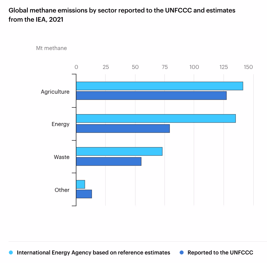
This bar chart from the International Energy Agency (IEA) compares the difference between IEA methane emissions estimates (light blue bars) and reported methane emissions from the United Nations Framework Convention on Climate Change (UNFCCC) (dark blue bars) in megatons across different sectors. Here, it is easy to see that there are additional methane emissions not accounted for by the UNFCCC in the agriculture, energy, and waste sectors. In the “Other” sector, IEA estimates of methane emissions are actually less than those reported by the UNFCCC.
Bar charts are perfect for measuring and comparing between discrete quantities in different categories. For example, bar charts can be used to compare metrics like EV sales by vehicle model, quarterly business expenses by department, or newsletter readership by subscriber type.
Show proportional parts of a whole with pie and wheel charts
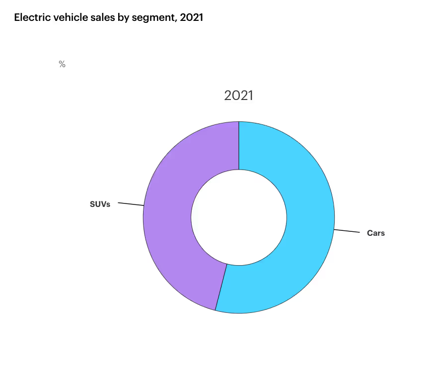
A radial wheel chart is essentially a pie chart with a different stylistic presentation, as seen in the example above from the IEA showing the breakdown of passenger EV sales by vehicle segment in 2021. Both a pie and wheel chart are used to demonstrate proportional parts of a whole. For example, in the above radial wheel chart, it’s evident that cars made up almost two-thirds of total EV sales in 2021. As the transportation sector continues to decarbonize, will electric SUVs constitute more or less of the market as other models become available? A complementary radial wheel chart for purchases in a future year would make it easy to track these changes.
Pie and wheel charts can also be used to show the proportional market shares of competitors, the demographic composition of a customer base, and more.
Display temporal changes with line charts
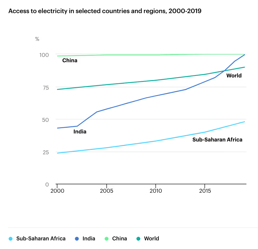
A line chart makes temporal changes easy to understand and digest. For example, this IEA line chart, which shows the percentage changes in access to electricity over time in various regions around the world, makes it clear that India has made considerable progress over the last two decades. However, inequity in access to electricity is also laid bare in this chart – barely half of Sub-Saharan Africa had access to electricity in 2019. In looking at this chart, it’s obvious that much more investment is necessary to bring widespread access to electricity to developing nations around the world.
Businesses can also use line charts to show improvements in sales, compare changes in demographics over time, or identify trends in a market.
Show proportional changes over time with area charts
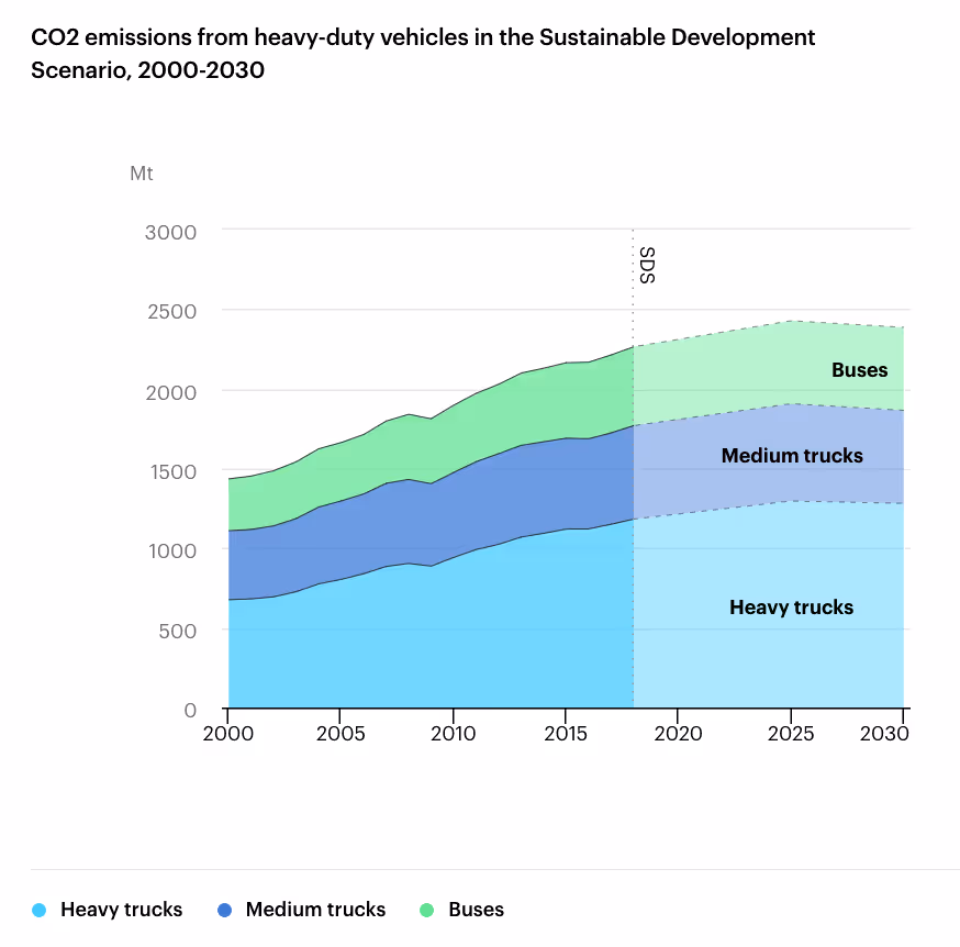
An area chart is essentially a multi-line chart with the underlying area of each line filled in. These charts are great for showing proportional changes of a cumulative whole over time. The area chart above from the IEA shows how the emissions of different heavy duty vehicles must change over time to comply with the Sustainable Development Scenario (SDS). To comply with the SDS, cumulative vehicle emissions must peak below 2,500 Mt around 2025, and then continue to fall.
Area charts are perfect for showing any changes in proportionality over time, like competitor market shares, or energy project capacity projections.
Upping the ante with more complex visualizations
Some data can’t be summarized with a simple bar chart. Often, a more visually complex graphic is necessary to show the flow of data between points, or spatial information like state-by-state values. For companies dealing with complex customer bases, varied types of products, or even the movement of people or products, a more technical approach is required. You can take data visualization a step further, with more complex charts like the ones below.
Show the flow of values between nodes with Sankey charts
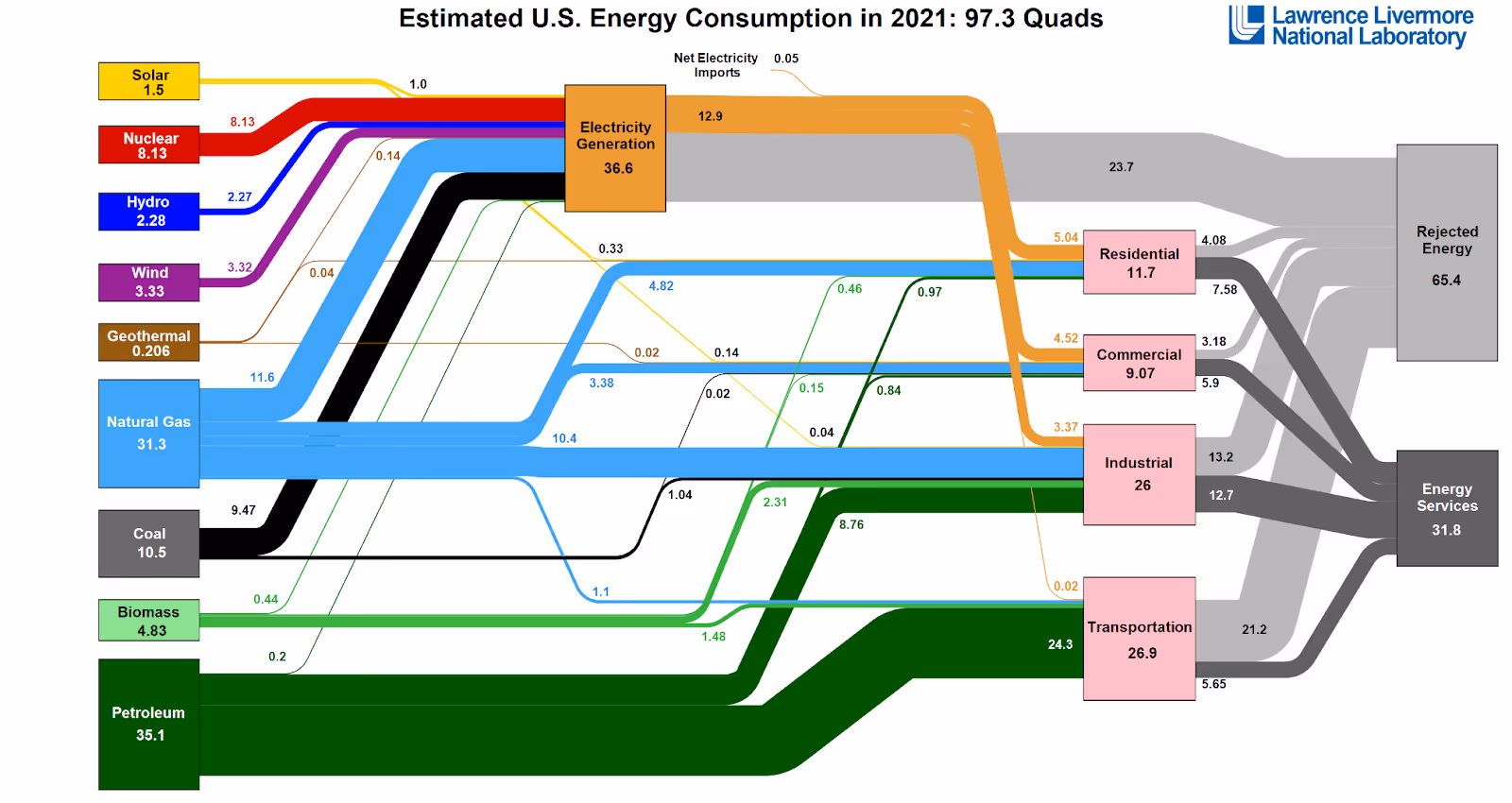
A Sankey chart is a more visually complex chart that shows the movement of one set of values to another with pathways connecting starting nodes to ending nodes. Above, this Sankey chart from the Lawrence Livermore National Laboratory describes the flow of energy in quadrillion BTUs, from its production to its consumption in various end use sectors in the US in 2021. Here, it’s evident that only 31% of the entire US energy portfolio was directed to “Energy Services,” which is energy that is put to use. The rest of the energy generated (about two thirds) was lost to waste, almost entirely in the form of heat from fossil fuel combustion. This widely-referenced chart demonstrates just how crucial it will be to continue to decarbonize and increase energy efficiency across all sectors.
The flow of goods, the spread of wealth, and even patterns of migration can also be described using a Sankey chart.
Show spatial patterns with choropleths
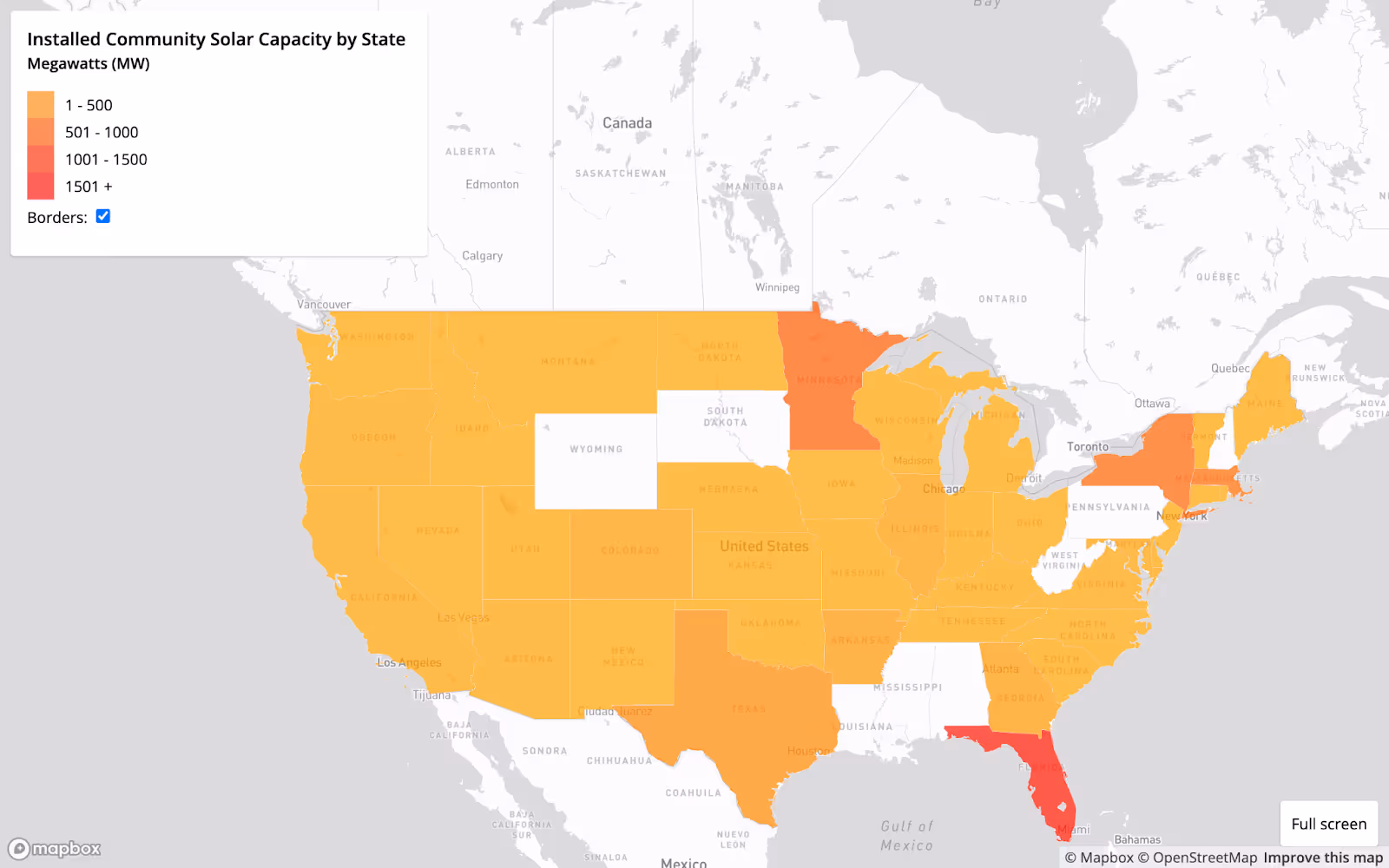
A choropleth is a map that shows geographic differences in values. A choropleth is similar to a heatmap, but it has distinct geographic boundaries, which allow for clear comparison across defined regions. This choropleth from the DG+Design Library shows community solar capacity by state. Darker regions represent greater capacity, and lighter regions represent lower capacity. In looking at this choropleth, some might be surprised to see Florida leading the country in solar capacity.
Choropleths can be used to show election results, regional customer concentrations, or even EV ownership suitability scores.
Use data visualization to empower your business operations
Whether you work in renewable energy, electric vehicles, sustainability, or any industry that uses data, you can paint a powerful picture and tell a story with data visualization. You can use data visualization to inform your business strategy for creating marketing campaigns, targeting customer segments in sales outreach, or outflanking your competition. Leveraging data effectively is essential to staying afloat in today’s economy – in fact, 92% of organizations invest in data today – and doing so can empower your business to grow.
With as many different kinds of data visualizations as there are, knowing how to visualize your data in the most effective way is what separates a simple graphic from a guidelight for your business strategy. At DG+, we pride ourselves on being data nerds, with diverse and complementary experience in industry, research, and writing. Our in-house market research team can conduct in-depth analyses on your target market, and develop actionable reports tailored for your business goals. We can help you leverage data visualization to inform your business’ marketing efforts, strategic initiatives, outreach campaigns, and more – so you can move forward confidently.
Read more news and insights from the DG+ team.


.png)
.avif)
.avif)

Let’s talk about what you’re building.
Whether you’re refining your positioning, preparing for growth, or trying to make a complex product easier to understand, we’d love to hear more. Share a bit about your goals or challenges and we’ll get back to you with a clear, honest perspective on how we can help.
Skip the form and email us directly at hello@dgplusagency.com