
First impressions are everything. Contrary to a certain saying, you absolutely can judge a book by its cover, and people frequently do. The same goes for movie posters, cereal boxes, footwear commercials, social media ads, and more. Human beings are drawn to eye-catching design, and marketing and creative professionals use this fact to help businesses stand out from their competition. Whether you’re selling to consumers or corporate giants, strong branding can be the difference between getting noticed and getting passed by.
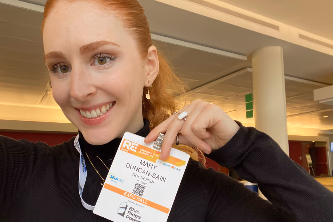
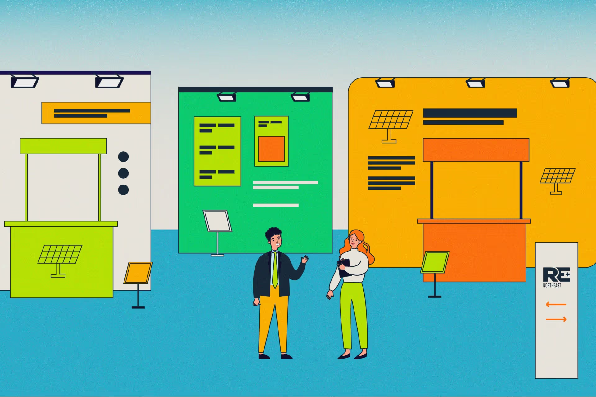
Last month, DG+’s very own Mary Duncan-Sain took a spin around the RE+ Northeast expo hall, where dozens of renewable energy businesses had set up displays in hopes of grabbing the attention of their customers, colleagues, and competitors. She walked away with some valuable insights on the trends shaping the renewable energy industry’s branding and design. Here are her main takeaways:
The renewables industry has a look.
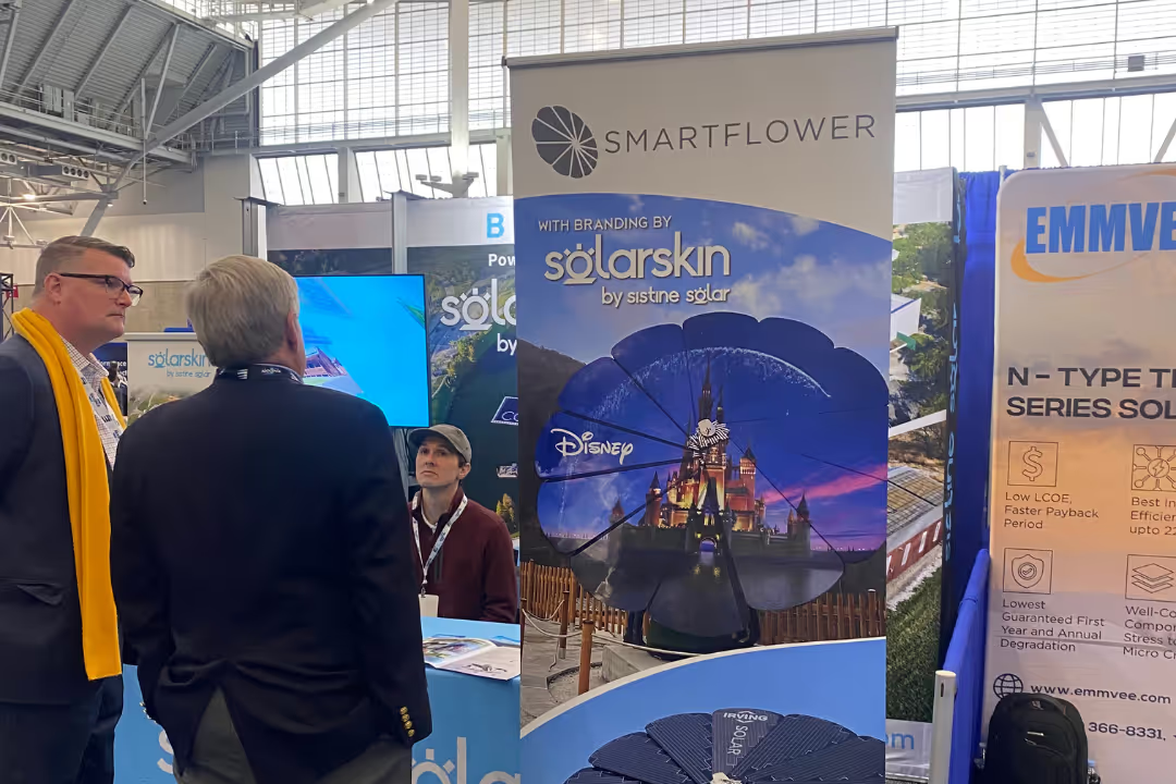
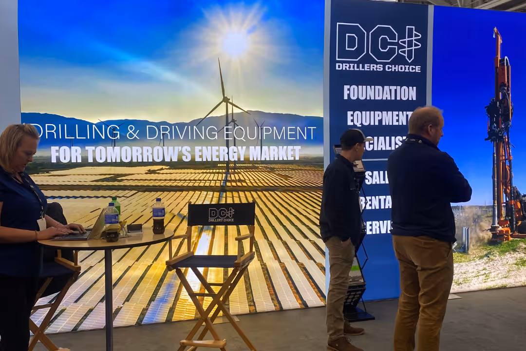
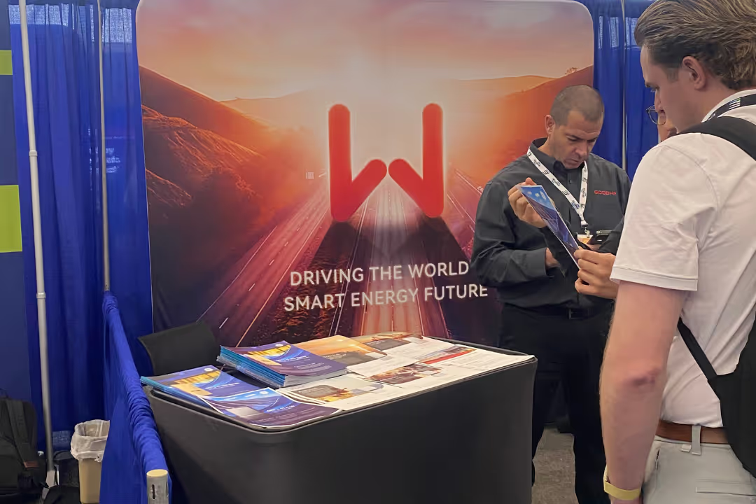
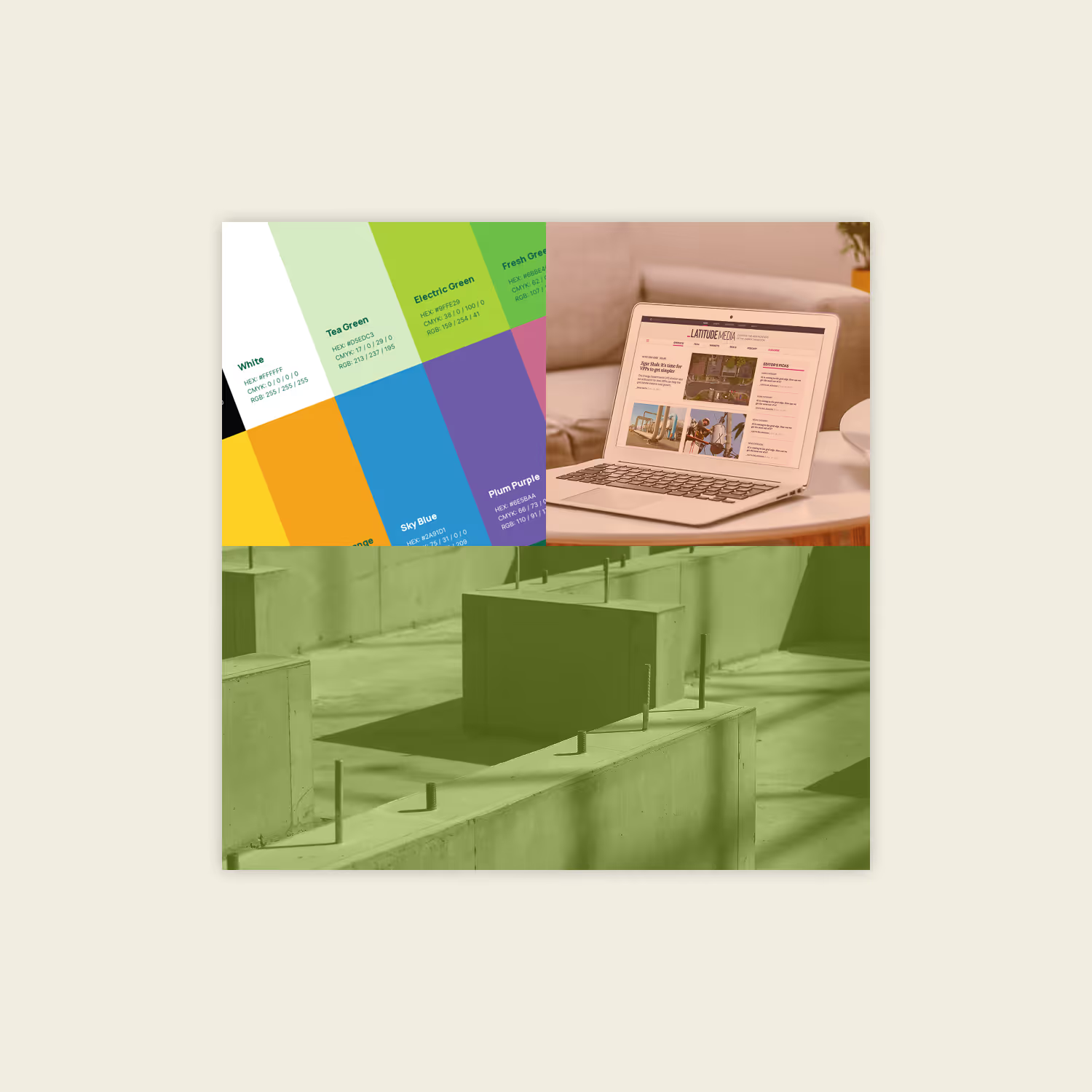
The RE+ Northeast expo hall, which featured businesses specializing in everything from giant solar-panel-securing stakes to battery fire prevention technology to flower-shaped solar installations, was awash with a handful of colors that have become synonymous with the renewable energy industry. Dark blues, greens, and golden yellows were the most common hues, followed by a few lighter blues, oranges, and the occasional red.
Photography was a popular element, too. On banners and company collateral, aerial images of solar arrays and wide shots of renewable projects were on display, focusing on the technology itself. People were less prominent in these images, though there were a handful of hard-hat-wearing construction workers featured in action on solar project sites.
Whether they’re visually different to the competition or not, these elements can shine by following basic design principles, Mary explains. Businesses can stand out even further by using colors that aren’t typically featured in renewable energy branding or experimenting with visual media outside of photography. That could mean adding unique secondary or tertiary colors — neutral tones, for example, or purple, which showed up almost nowhere in the RE+ Northeast expo hall — to complement a company’s existing logo or incorporating elements like illustrations or graphics into marketing materials.
“We see a lot of green and blue colors in this industry's branding,” Mary says. “I'm interested in what the next widely used color will be and how companies can evolve to really differentiate themselves from their competitors through design.”
Even small extras go a long way.
While most booths featured a standard setup — a backdrop, a banner, a branded tablecloth, and some marketing materials — Mary found a few that stood out from the pack, in ways both big and small.
Some had particularly unique designs: interesting uses of color, for example, or thoughtful imagery that visually communicated an idea to passersby. Others used additional elements like backlit signage to make their displays quite literally shine amid a sea of competitors.
Still others pulled out all the stops and sprung for more eye-catching installations like floating banners positioned above their booth space or three-dimensional sculptures featuring their logo design.
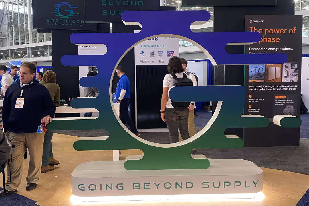
The cost of these displays undoubtedly varies, but Mary was impressed by the businesses that managed to make a statement even with more modest add-ons like extra lighting. After all, these details can mean the difference between curious conference-goers stopping to chat or passing your booth over in favor of a flashier or more polished neighbor.
Good design is a worthy investment.
This is no shocker, especially coming from us, but high-quality design and thoughtful branding pays off. Your company's appearance signals to passersby how professional, and potentially even how trustworthy, you are.
Walking around the expo hall, Mary says, it was clear from the get-go who had — and had not — invested in their visual design and branding. Standout booths and businesses featured crisp, clean images, unique logo designs, and balanced composition, even for basic marketing materials and banners.
Traditionally, the renewable energy industry — and B2B marketing in general — hasn’t been as flashy as its B2C counterparts. The (misguided) thinking goes that if you’re good enough at what you do, you don’t really need to appeal to other businesses; word will get around.
But consider this: Whether you’re marketing to the masses or trying to convince a few executives to ink corporate deals, your audience is human. C-suite execs laugh, cry, and feel things just like the rest of us, and they, too, are drawn to thoughtful, inspired, and inspiring design. Once those folks are in the door, it’s up to you and your business to deliver, but if the door doesn’t look inviting? No one’s coming inside.
The future of renewable energy marketing is bright.
After the conference, the big question on Mary’s mind was: What’s the next design trend in renewable energy marketing?
After years of identifying as an offshoot of the energy industry, renewable companies can no longer bank on the eco-friendly signaling of yesteryear to persuade their customers or collaborators to do business. With more and more players entering the space, the need to differentiate — from both a branding and marketing perspective — is growing more acute. The RE+ Northeast expo hall provided proof that the businesses taking their visual presence seriously are well positioned to be at the forefront of this evolution. Better still, those who lean into innovative, forward-thinking design and branding will be the leaders everyone else looks to as the energy transition accelerates.
Tips for your next conference
Heading out to meet your peers? Before you take off to your next conference, consider these tips for your business’s visual design and branding:
- Do use high-resolution files to print your branding materials. Low-resolution images wind up looking pixelated or grainy.
- Do emphasize hierarchy by utilizing headings and subheadings or color to highlight important information. Writing every bullet point on your banner in all caps text isn’t eye-catching; it’s aggressive, and when everything is highlighted, nothing is.
- Do check out your competition’s messaging. Solar energy companies, for example, may have a lot of overlap in their services, making it easy to adopt similar language as their competitors, even by accident. Think outside the box with your messaging.
- Do give your layout of visual elements space to breathe. Crowded designs can make your materials look busy and chaotic. Less is more, so don't be afraid of leaving white space.
- Do make sure your brand is aligned across the board, from print materials to your company website. You don’t want to wow potential customers or partners at a conference and then have them do a double-take when they try to find you online. User-friendly, organized, and visually appealing web design will make your business look more professional.
Need a little design help before your next conference? Let the DG+ team help you look your best in front of peers and potential customers. Contact us today.
Read more news and insights from the DG+ team.
.png)
.avif)
.avif)
Let’s talk about what you’re building.
Whether you’re refining your positioning, preparing for growth, or trying to make a complex product easier to understand, we’d love to hear more. Share a bit about your goals or challenges and we’ll get back to you with a clear, honest perspective on how we can help.
Skip the form and email us directly at hello@dgplusagency.com