Caban
A full rebrand — with new website, messaging, and design — to convey the impact of complex energy storage hardware, software, and service solutions.

HIGHLIGHTS
4 month turnaround
for delivery of arefreshed brand identity, key messaging, and turnkey website
Reduced page load time (LCP) by 64%
and increased PageSpeed Insights desktop performance score by 31 points.
A new visual identity
that is authoritative and sophisticated across digital, print, and environmental touchpoints
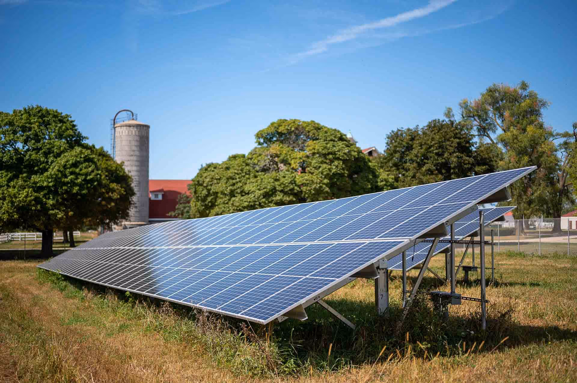
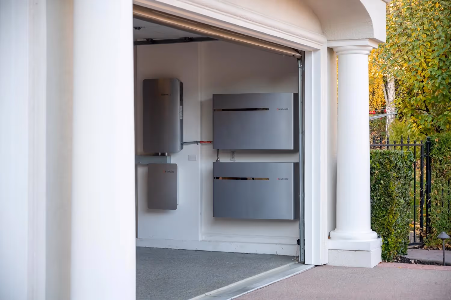
Caban provides distributed renewable energy solutions for critical infrastructure, including some of the world's largest telecommunications companies. Caban uniquely combines hardware, software, services, and financing to simplify the energy transition. This turnkey approach allows clients to work directly with one trusted ESG partner to achieve lower-cost and lower-carbon energy. Created in the U.S. and deployed globally, Caban is the premier choice for reliable, scalable, and affordable renewable power and energy storage.
THE CHALLENGE
Caban needed a new logo and a visual brand refresh.
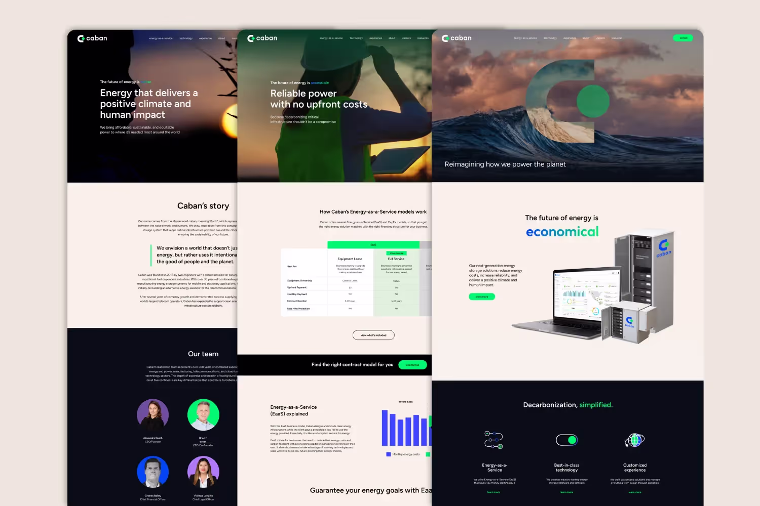
Further, it needed a messaging playbook that could speak to multiple audiences about the many benefits of its unique and multifaceted offering. It wanted to leverage the fresh design and messaging for a new website.
Messaging
Caban’s legacy messaging focused predominantly on the technical aspects of its solutions rather than the need for its solutions. Further, Caban’s offering is anything but one-dimensional: Caban tackles decarbonization with every piece of the puzzle under one roof — hardware, software, financing, and managed services. The trouble with its legacy messaging was that it left audiences confused about what exactly Caban did: Did it make batteries? Was it a software provider? Did it finance solar + storage solutions for critical infrastructure? The correct answer was: All of the above.
In addition, Caban leadership wanted to expand its messaging beyond how its solutions improve operations and reduce costs — it wanted to explain why this work was so important for both people and the planet. The “how” and the “why” needed to converge in its new messaging.
Logo and brand refresh
When we began this branding project, Caban was eager to move away from its previous visual identity, which had become outdated for representing its forward-thinking renewable energy technologies and innovative spirit. As Caban continued rapidly expanding to meet surging infrastructure power demands sustainably, it wanted a new modern look to truly reflect its precision solutions while also building confidence through premium, authoritative branding.
Our mandate was developing a flexible yet consistent visual system that could scale globally while letting Caban’s remarkable expertise and passion around enabling the clean energy transition shine through. This meant an iconic, recognizable brand identity with the reliability and adaptability to grow along with the company. The new logo, branding guidelines, and website needed to speak to Caban's commitment to sustainable innovation and its position as a visionary partner providing complex infrastructure with fully renewable battery platforms.

SOLUTION
Messaging
To crack the code on Caban’s messaging, we needed to understand how people at the company spoke about Caban. We sat down and individually interviewed 10 key stakeholders, including the CEO, co-founders, chief revenue officer, director of software, vice president of engineering, and more. Interestingly, everyone we spoke to had a slightly different take on what Caban actually does. It was becoming clear that this was likely the root of its challenge with outward-facing messaging. If the leaders of the company didn’t align on what Caban does, how could a potential client be expected to glean it?
In an effort to find the correct throughline, we mapped out the similarities and differences we uncovered in our interviews. We then shared our map with the Caban team and followed up with further questions to identify what was a company-wide priority and what was perhaps a departmental priority. Both the big picture and the minutiae were important, but we had to establish a hierarchy to nail down consistent messaging.
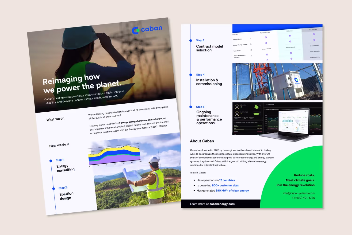
With priorities in place and an understanding of both Caban at that time and the vision of Caban’s future, we got to work. We developed key messaging that conveyed its unique value to various audiences across the globe. We then leveraged this messaging across the new website, sales collateral, and internal materials.
Logo and brand refresh
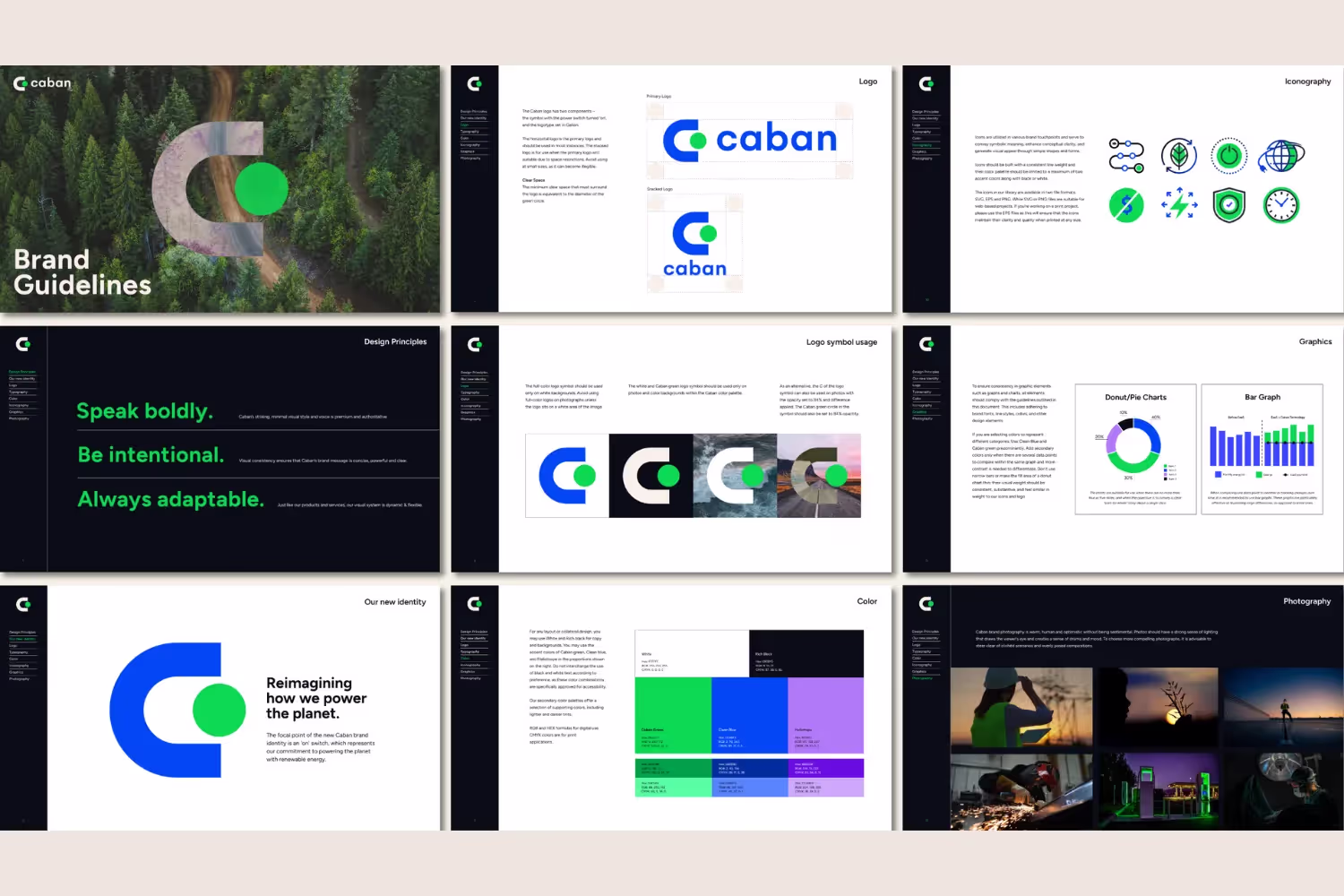
Our creative team worked closely with Caban’s stakeholders to develop a new brand identity and visual system centered around an “on” switch focal point. This succinctly encapsulates Caban’s mission to power the planet's critical infrastructure through innovative renewable energy solutions.
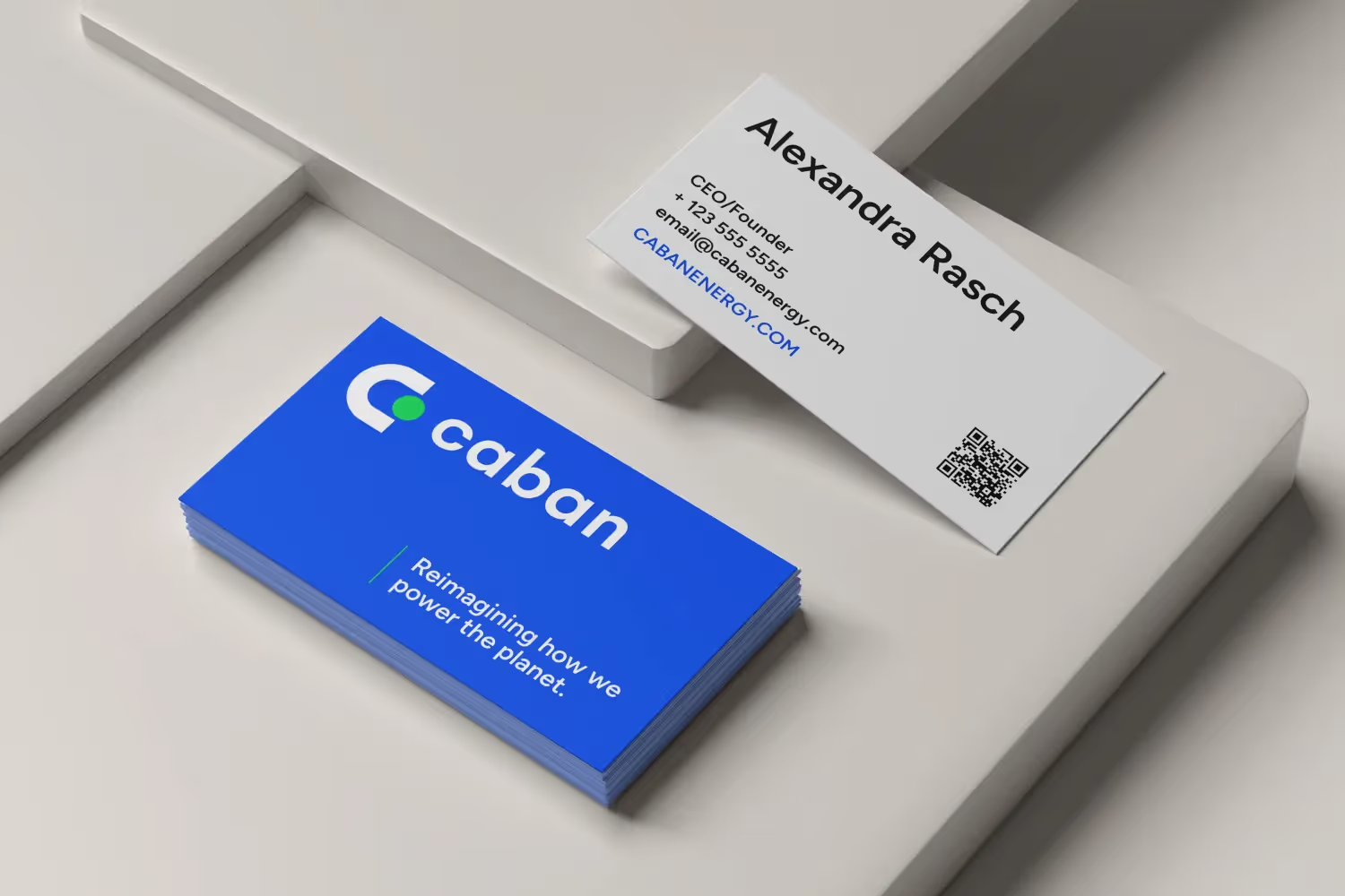
- The logo: The Caban logo comprises two key components. The first is the logomark featuring the stylized “on” switch, instantly communicating Caban’s role in enabling the global transition away from fossil fuels. This is paired with the logotype set in Gelion, a versatile sans-serif font conveying progress and innovation.
- Visual identity and applications: Caban’s minimalist visual identity aims to project premium authority on renewable energy matters. It employs vibrant colors like green, blue, and purple paired with ample white space to craft an uncluttered, sophisticated style. This look and feel extends across branding guidelines for digital, print, and environmental touchpoints. Visual consistency helps reinforce brand recognition while dynamic applications keep the identity adaptable across contexts and flexible for growth.
A key aspect of Caban’s visual identity is photorealistic imagery that builds an emotional connection and sense of humanity. We aimed for photographs with a warm, optimistic quality — enabling viewers to envision the renewable energy future Caban is helping create without relying on sentimental environmental tropes.
Much like Caban’s suite of technologies powering complex infrastructure needs, its new visual system is both dynamic and flexible. The guidelines provide guardrails to maintain clarity of messaging through color specifications, logo clear space requirements, and core graphic elements. The ultimate goal was crafting a future-forward brand identity as scalable, reliable, and renewable as Caban’s battery solutions.
Working with DG+ has been seamless, in design, transparency, and timing. We are very pleased with their work as it elevated our branding to the next level.